Brand system
[Live Web
for AI & Data Teams.
The rules behind the new IPLoop site: a white, gridded technical canvas, Geist in two voices, one electric blue, and square corners everywhere. Everything in one place: the system, and every asset built from it.
Engineered, not decorated.
Precise and quiet.
// 001
Blueprint canvas
White ground, 1px hairline borders, visible grid cells. Structure is shown, not hidden behind shadows.
Lines over shadows
// 002
Two voices
Geist speaks in sentences. Geist Mono speaks in labels, commands and numbers, always uppercase.
Human + terminal
// 003
One signal colour
Everything is greyscale until something is live, active or important. Then it turns #0055FF.
Blue means live
One blue.
A disciplined grey ramp.
Roughly 90% neutral, 10% blue. The greys are true neutrals with no tint, which keeps the blue electric.
IPLoop Blue
Logo, active nav, highlighted headline words, key links, section indices. Never as a large background.
Sky
Secondary blue for hover states, map pins and gradients paired with IPLoop Blue.
Indigo
Deep accent for illustrations and depth. Use rarely.
Ink
Headlines, primary buttons, dark bands.
Graphite
Body copy on white. Borders on dark.
Steel
Eyebrows, meta labels, secondary tabs.
Silver
Body copy on dark. Index totals.
Silver 300
"//" separators, disabled.
Line
Every 1px border on light.
Mist
Dot-matrix panels, input fills.
White
Page ground.
Dark surfaces: #1A1A1A bands · #121214 deepest · 48px grid lines in #474747. Blue on white = 6.0:1, passes AA for all text sizes.
Blue is a signal.
Spend it carefully.
Three rules keep the palette working: which pairs pass contrast, how much blue a layout can carry, and what swaps in dark mode.
Ink on white | #1A1A1A / #FFFFFF | 17.4:1 · AA | Headlines, body |
Graphite on white | #474747 / #FFFFFF | 9.3:1 · AA | Body copy |
Steel on white | #7A7A7A / #FFFFFF | 4.3:1 · AA large | Labels 14px+ only |
Silver on white | #ADADAD / #FFFFFF | 2.2:1 · Fail | Decorative only, never text |
Blue on white | #0055FF / #FFFFFF | 5.6:1 · AA | Links, accents, any size |
Blue on mist | #0055FF / #F5F5F5 | 5.1:1 · AA | Links on panels |
White on ink | #FFFFFF / #1A1A1A | 17.4:1 · AA | Dark-band headlines |
Silver on ink | #ADADAD / #1A1A1A | 7.8:1 · AA | Dark-band body |
Steel on ink | #7A7A7A / #1A1A1A | 4.1:1 · AA large | Dark-band labels 14px+ |
Blue on ink | #0055FF / #1A1A1A | 3.1:1 · AA large | Large text (24px+) or glyphs only |
White on blue | #FFFFFF / #0055FF | 5.6:1 · AA | Active nav, chips |
Ink on blue | #1A1A1A / #0055FF | 3.1:1 · AA large | Never |
Ratios are WCAG 2.2. AA = normal text passes. AA large = 24px+ regular or 19px+ bold only. In dark mode the blue lifts to #3D7DFF for small text (4.6:1 on ink).
The blue budget
Blue covers no more than 10% of any layout. One highlighted word in a headline, the active nav cell, links and one accent per card. If two things are blue, one of them is wrong.
Never as a wash
Blue is never a page or section background. The only large blue fills are the bar chart, the active step bar and the pixel-font typed phrase. Buttons stay ink; blue is their hover.
Dark mode swaps
White → #121214 page, #1A1A1A panels. Ink text → white. Graphite body → #CCCCCC. Line #E0E0E0 → #2E2E30. Blue stays #0055FF for glyphs and large text, #3D7DFF for small text.
Geist for sentences.
Geist Mono for signals.
Tight negative tracking on everything. Display sizes run at −6%, text at −5%, mono labels at −4%. Weights stay light: 400 for headlines, 500 for card titles and labels, 600 only on primary buttons.
| display-xl | Geist 400 · 72/79 · −6% | Try it free |
| display | Geist 400 · 56/62 · −6% | Live web data. |
| price | Geist 400 · 64/70 · −6% | $1.50/GB |
| h3 / stat | Geist 400 · 32/38 · −5% | 200M+ Residential IPs |
| h4 | Geist 500 · 24/31 · −5% | AI-Powered Unblocking |
| lead | Geist 400 · 18/23 · −5% | Real residential IPs for AI agents and data teams. |
| body | Geist 400 · 16/21 · −5% | Choose rotating IPs or a sticky session for your workflow. |
| mono-lg | Mono 400 · 32/35 · −6% · caps | Intelligence layer |
| mono-button | Mono 600 · 16 · −5% · caps | Get started |
| mono-label | Mono 500 · 14/18 · −4% · caps | > Key value |
| mono-caption | Mono 500 · 12/16 · −4% · caps | Setup · Quick start · Basics |
Accent face: Geist Pixel Square, 72px, blue, used for one typed-out phrase per hero ("[Live Web", "[unified"). Fallback: Geist Mono.
Square, bordered,
labelled like a terminal.
Buttons · radius 0 · 48px tall
Primary: ink fill, white mono, 8px square glyph left, label pushed right. Hover turns blue. Secondary: text + 1px underline with a ▷ glyph.
Segmented nav
Joined cells with 1px dividers. Active item: blue fill, wrapped in < >. Counts sit in a blue outlined box.
Section eyebrow
Every section opens with [N.index/total], a short rule, a ">" prompt label, then a rule to the edge. Two-line headline follows.
Tags & indices
SetupTargetingSessions[#RESIDENTIAL] & [#PROXIES]
Card indices use "// 001" with the slashes in Silver 300. Hashtags go in square brackets.
Agent
Protocol
IPLoop MCP
Dark card: ink fill, #474747 borders, white title, silver body.
Twelve columns.
Everything on the grid.
Grid
- 1440 page, 1200 container (120px margins)
- Cards share borders: no gaps, no radius
- 3- and 4-up card rows; 2-col split for heading + CTA
- Section spacing 96–120px
Texture
- Dark bands: 48px grid lines in #474747
- Light panels: 8px dot matrix on #F5F5F5
- Marquees in blue mono caps
- No gradients on UI, no shadows on cards
Imagery
- Isometric line illustrations, 1px ink strokes
- Active step fills the illustration in blue
- Pixel icons (square outlines) on dark cards
- Photography only as small avatar stacks
Three families.
Each with one job.
The site mixes three icon styles on purpose. The rule is which one goes where, not which one you like.
Pixel
11×11 grid, hard edges, one colour. For feature and philosophy cards on light panels, and the square outlines on dark cards. Draw on the grid; never anti-alias or scale to a non-integer size.
Sizes: 44 · 56 · 80px on a #F5F5F5 tile
Isometric line
1px ink strokes, 30° isometric, no fills except the active state, which fills solid blue. For process steps and anything that shows a system. One per card, bottom-right.
Sizes: 48 · 96 · 110px · stroke 1.4px
Stroke
24px grid, 1.5px stroke, square caps, no fills. For UI and diagrams: lists, labels, the signals diagram, product screens. Use a single set (Lucide is a close match) and don't mix weights.
Sizes: 16 · 20 · 24px · colour #7A7A7A or #ADADAD
Avoid
- Emoji anywhere in product or marketing
- Filled or duotone icon packs
- Rounded, "friendly" icon sets (they fight the square corners)
- Mixing two families inside one card
Colour
- Icons are grey (#474747 light, #ADADAD dark) by default
- Blue only for the one active or selected item
- White on ink bands
- Never blue and ink together in one icon; the logo is the only two-tone mark
Black and white.
Square. Plain.
Photos appear in exactly two places: team portraits and small avatar stacks. Both follow the same four rules.
✓ Greyscale, always
✓ Square crop, chest up, eyes at the top third
✓ One mono label max, top-right, on white
✕ No colour, no filters, no gradients
Backgrounds
Plain studio grey or a wall. No offices, no laptops, no stock "team at whiteboard". If the background has detail, blur it or reshoot.
Illustration instead of photos
Product, network and data ideas are always drawn (isometric line or pixel), never photographed. No server-room stock images, no globe-with-dots.
Licensing
Use our own photos. If a stock image is unavoidable, use a paid licence (Unsplash+ or Getty), keep the receipt in the brand folder, and convert it to greyscale.
Short sentences.
Full stops.
Headlines are two short declarative lines, each ending with a period: the first states what it is, the second what it does. Copy speaks to AI agents and data teams in plain, concrete terms.
Say
- "Real residential IPs. AI-powered web access."
- "Simple pricing. Pay for what you use."
- Real figures: 200M+ IPs, 195+ countries, $1.50/GB
- Vocabulary: live web data, residential IPs, sticky / rotating sessions, MCP, endpoints
Avoid
- Hype adjectives: revolutionary, seamless, cutting-edge
- Exclamation marks (only the final CTA uses one)
- Title Case in body; mono labels are always CAPS
- Rounded pills, soft shadows, purple gradients
A two-tone mark.
A plain wordmark.
Usage
- Two-tone mark: the offset cross in ink (on light) or white (on dark), and the diagonal plus two dashes always #0055FF
- Wordmark: Geist 500, −5% tracking, ink or white
- Mark height = 1.4× wordmark cap height; gap 10px
- On black: white cross, blue diagonal, on #121214. Used for the app icon, favicons and social avatars (400×400 on X and LinkedIn)
- Clear space: one mark width on all sides
One mark.
Used one way.
The mark is two-tone: the offset cross in ink or white, the diagonal and its two dashes always #0055FF. Everything below follows from that.
✓ Clear space: one mark width on every side
✓ Minimum size
✓ One-colour fallback: ink, white or blue, only where two colours are impossible (embroidery, stamps, engraving)
✕ Stretched or squashed
✕ All blue (the old mark)
✕ Rotated
✕ Recoloured
✕ On a gradient or busy image
✕ Shadows, glows or outlines
✕ Gap tighter than 10px
✕ Stacked lockup (not yet drawn)
Wordmark spelling
In the logo lockup the wordmark reads IPloop (lower-case l). In all running text, titles, legal documents and social copy the company is IPLoop with a capital L. Never "IPLOOP", "Iploop" or "IP Loop".
Lockup: Geist 500 · tracking −5% · gap 10px · mark height = 1.4× cap height
Files
- iploop-mark-on-light.svg · ink cross, for white and mist
- iploop-mark-on-dark.svg · white cross, for ink and night
- iploop-mark-one-colour-*.svg · ink, white, blue fallbacks
- iploop-app-icon.svg · white mark on #121214, 15% padding
- iploop-lockup-on-light/dark.png · for documents and email
- PNG marks at 64, 256 and 1024px; favicons 16–512px + .ico
- social-avatars/ · 800×800 profile pictures on black, ink and white
Ready to use.
Don't rebuild them.
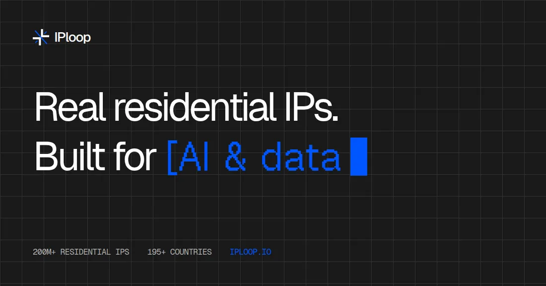
Every file is in the brand book folder under 04-templates. Legal entity, address and registration number are placeholders until confirmed.




Documents
Body Geist 10.5pt in #474747, headings Geist 500 in ink, labels Geist Mono 7pt caps in #7A7A7A. Margins 25mm. Hairline rules only; no colour fills except the #F5F5F5 meta row. Install Geist (free, SIL licence) or Word will substitute Arial.
Table-based, inline styles, one hosted PNG mark at 40px. No banners, no social icons, no quotes. Fonts fall back to Arial in most clients; that is fine. Upload the mark to iploop.io/brand/ before rolling out.
Decks
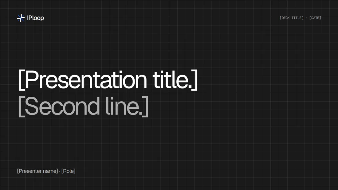
Dark grid title slide, white content slides, section eyebrow top-left, lockup bottom-left, mono page number bottom-right. 96px margins at 1920 wide. One idea per slide; three-cell grid for comparisons.
Ten headers.
One profile.
1500×500. Key content sits right of the profile photo, which covers the lower-left corner.


Ten posts.
Built from the site.
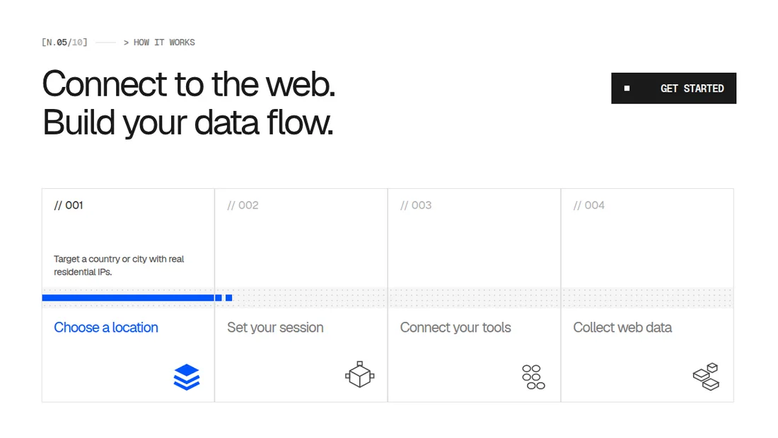
1200×675 (16:9), so X shows them uncropped in the timeline.




Five stories.
Vertical.
1080×1920. The top and bottom 250px are kept clear for app buttons.


Company page.
Profile, posts, articles.
Sizes follow LinkedIn's 2026 specs. Post 09 has placeholders to fill in before it goes out.
Company covers
4200×700 · 6:1


Profile banners
1584×396 · 4:1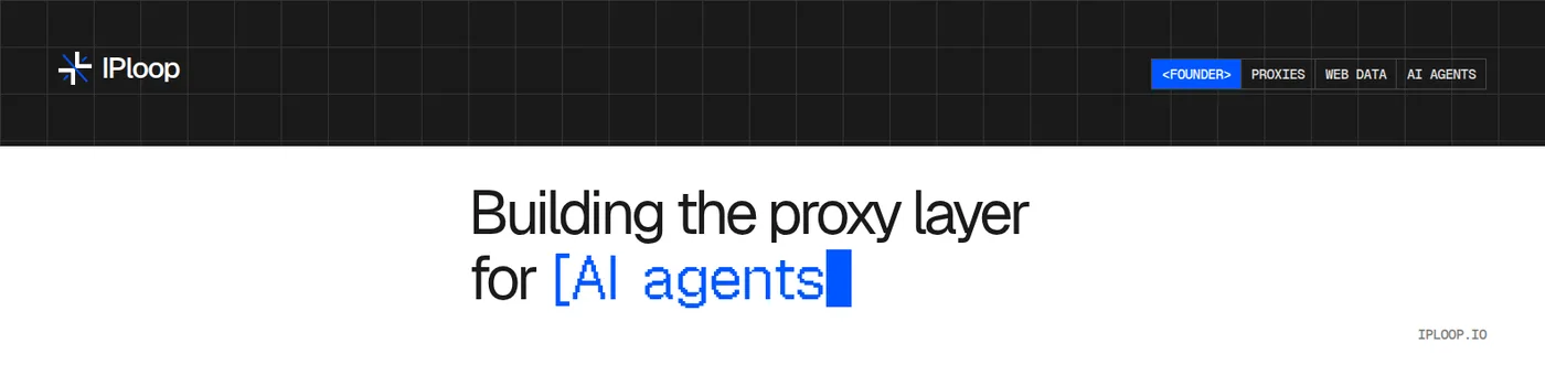


Posts
1080×1350 · 4:5
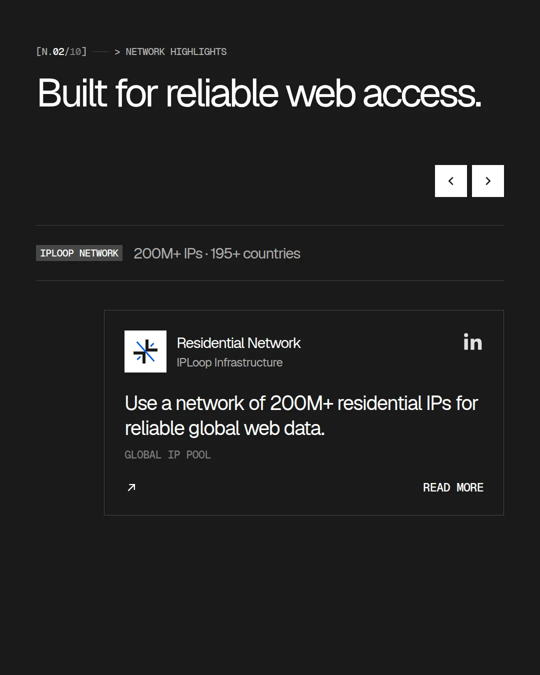
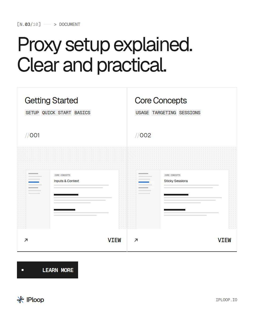


Carousel · Residential proxies, explained
5 slides · uploaded as a PDF


Article covers
1200×644


